Rachael Dinnis digital UX and UI designer. Bringing ideas alive in any channel.
Contact
M: +44 7974779405
Created as part of my recent UX diploma course, this project was a personal endeavour. It came from my own experiences of the Parkonomy car parking App. One day, while running late for an appointment, I decided to use the app. My confusing experience inspired me to explore ways to make it a better user experience and deliver tangible benefits for the company.
I’ve reviewed the current app to evaluate what works and what doesn’t – assumptions from my professional point of view.
In this evaluation, I’ve taken a close look at the current user interface and interaction design to assess its effectiveness, usability, and overall user satisfaction. My goal has been to identify areas of improvement and offer suggestions to enhance the user experience. Through this review, I aimed to ensure that the design aligns with user needs and business objective.
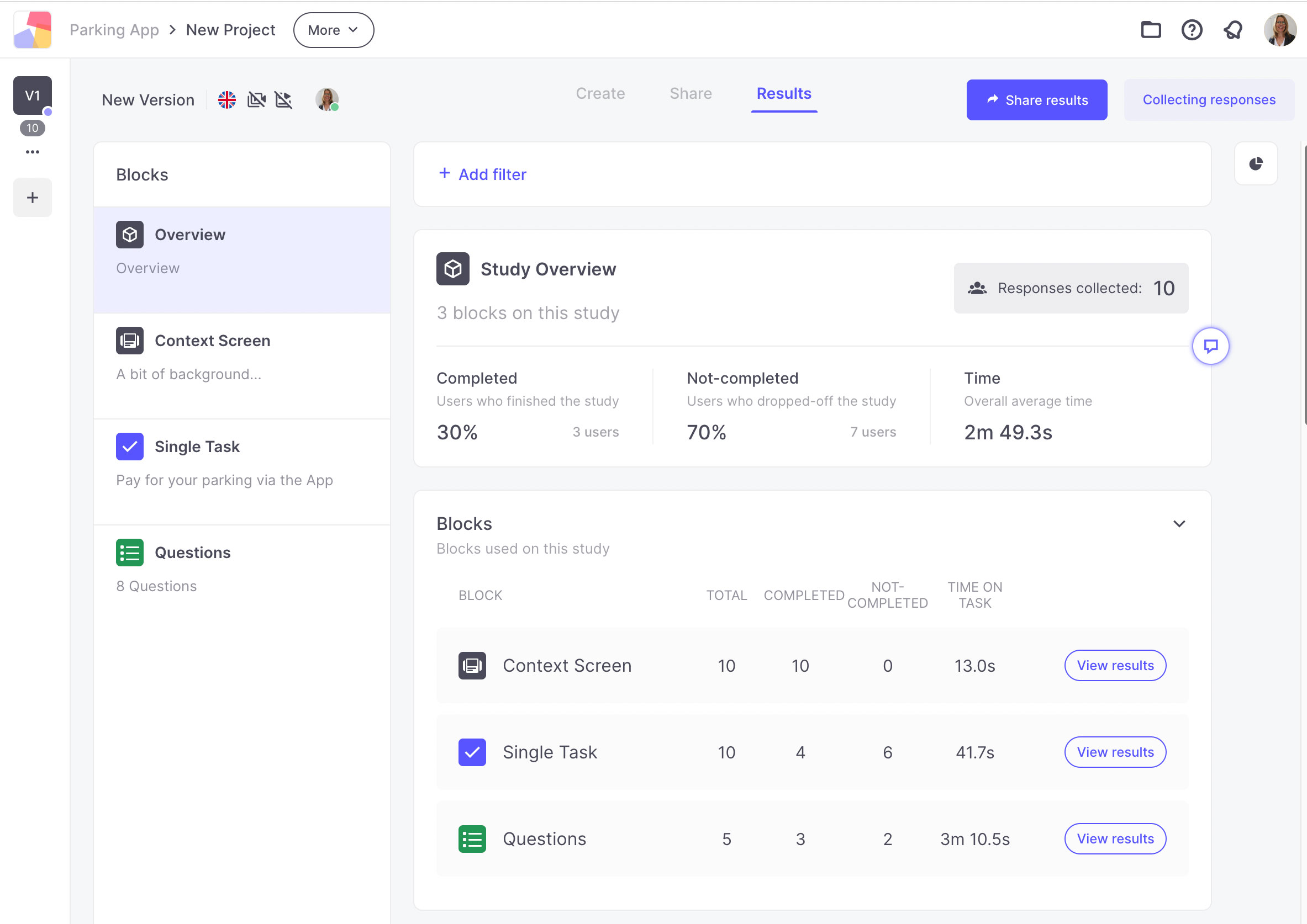
I want to understand the average user’s profile based on the current customer base, and prove my & business’ hypotheses.
When it comes to crafting questions and testing scenarios, I began by setting a clear research objective. Knowing what I wanted to achieve helped me create purposeful and effective questions and scenarios. I ensured that my questions and scenarios were easy to understand and avoided leading questions to extract genuine insights. I carefully selected question formats. For my face-to-face interviews, I used open-ended questions to encourage users to provide detailed insights, while my online research featured closed-ended questions and multiple-choice options for quick, predefined answers.
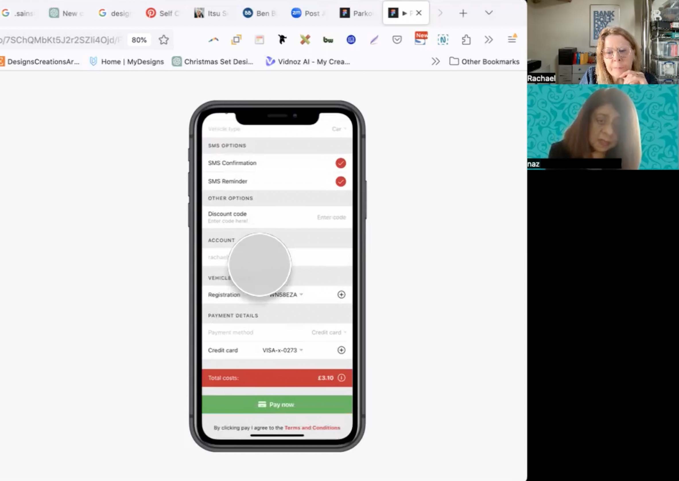
I organised four Zoom calls with car drivers to dive deep into what they really want from a parking app. We centred our discussion on the existing app. I presented them with a scenario where they had already parked their car, but were now running late for an appointment. I asked them to imagine they were walking through the parking area, and were trying to complete two tasks: firstly, find the price per hour for parking, and secondly to park their car successfully
I organised four Zoom calls with car drivers to dive deep into what they really want from a parking app. We centred our discussion on the existing app. I presented them with a scenario where they had already parked their car, but were now running late for an appointment. I asked them to imagine they were walking through the parking area, and were trying to complete two tasks: firstly, find the price per hour for parking, and secondly to park their car successfully


And in summary…
Through my research, I gained valuable insights into the significance of different research methods. I discovered that conducting face-to-face interviews provided a wealth of information about the app’s key aspects, while the online research yielded comparatively limited insights.
After research and confirmation of the assumptions below are the list of issues to be tackled
After reviewing competitor parking apps I would suggest the introduction of following new features…
I’d like understand how many steps does it take for users to complete a car parking booking.
By mapping out the various steps involved, from finding a parking spot to completing payment, I identified key opportunities to enhance user experience and mitigate potential issues.
I’d like understand how many steps does it take for users to complete a car parking booking.
The before and after comparison of the user interface (UI) demonstrates a significant improvement in clarity and visual hierarchy. In the initial design, users were presented with a cluttered interface lacking clear distinctions between options. This made it challenging for users, especially those standing in a hurry, to quickly identify the desired actions. To address this issue, several changes were implemented in the updated UI.
Clearer Visual Hierarchy: In the redesigned interface, elements are prioritized based on their importance and frequency of use. For example, primary actions such as “Pay” are now prominently displayed, while secondary options are visually de-emphasised. This ensures that users can easily identify and access the most critical functions at a glance.
Simplified Layout: The layout of the UI has been streamlined to reduce visual clutter and improve readability. Unnecessary elements have been removed, creating a cleaner and more focused interface. By simplifying the layout, users can quickly locate the information they need without being overwhelmed by irrelevant details.
Distinctive Visual Cues: Each option within the interface is now accompanied by distinctive visual cues, such as larger buttons or appropriate colour cues, for example replacing the red which suggest warning with a positive green. This enhances the user’s ability to differentiate between different actions, even when they are standing in a busy or distracting environment.
Overall, these changes have resulted in a UI that is not only clearer and more visually appealing but also more user-friendly, allowing users to navigate the app with ease, even in time-sensitive situations.
Following my initial iteration of the UI design, I conducted face-to-face research to evaluate the effectiveness of the new design in alignment with my assumptions. This phase of research provided me with invaluable insights, which subsequently led to additional design changes.
Rachael Dinnis digital UX and UI designer. Bringing ideas alive in any channel.
M: +44 7974779405